
Overview
Cymmetri, is a trusted advisor and partner for organizations looking to deploy IAM (Identity Access Management). As a longstanding design partner, we created a new module for the product to manage risks and control access for one of their clients BSE.
Cymmetri, is a trusted advisor and partner for organizations looking to deploy IAM (Identity Access Management). As a longstanding design partner, we created a new module for the product to manage risks and control access for one of their clients BSE.
01
Access Review Module
At the heart of this module are campaigns. Campaigns help ensure that the users have the right level of access to resources. Managers create campaign that runs between certain dates or that recurs at certain intervals.
We began by iterating on the overview card that shows campaign details. The goal was to show all necessary information in an easy way that helps user to grasp information quickly.
At the heart of this module are campaign access requests. Employees initiate requests for resources, but managers act as gatekeepers, approving only those necessary for the employee's job duties. Some key metrics of the redesigned module;
76% reduction in avg. time spent my managers on the module.
125% increase in the user satisfaction rate after the redesign.
93% reduction in frequency of user errors caused previously.
02 / PROCESS
Improving assigning efficiency by more than 62%
Managers perform actions on the review items from the users. After numerous ideation phases on how to present the wealth of information, leading to a refined design we subjected it to user testing.
While the received feedback was positive, we identified an opportunity for enhancement. The inclusion of thumbnails significantly sped up and simplified the managers ability to swiftly identify users requesting resources.
The post-user testing results showcased a 62% increase in efficiency. The additional time and effort invested in refining helped in achieve better results.
Extensive user research and usability testing identified user pain points and the business problem. Through an iterative design process, I refined solutions, incorporating user feedback to ensure they effectively addressed these issues, maximised user efficiency and most importantly achieved the business goals of Cymmetri.
For a comprehensive analysis, please refer to the detailed case study.


03
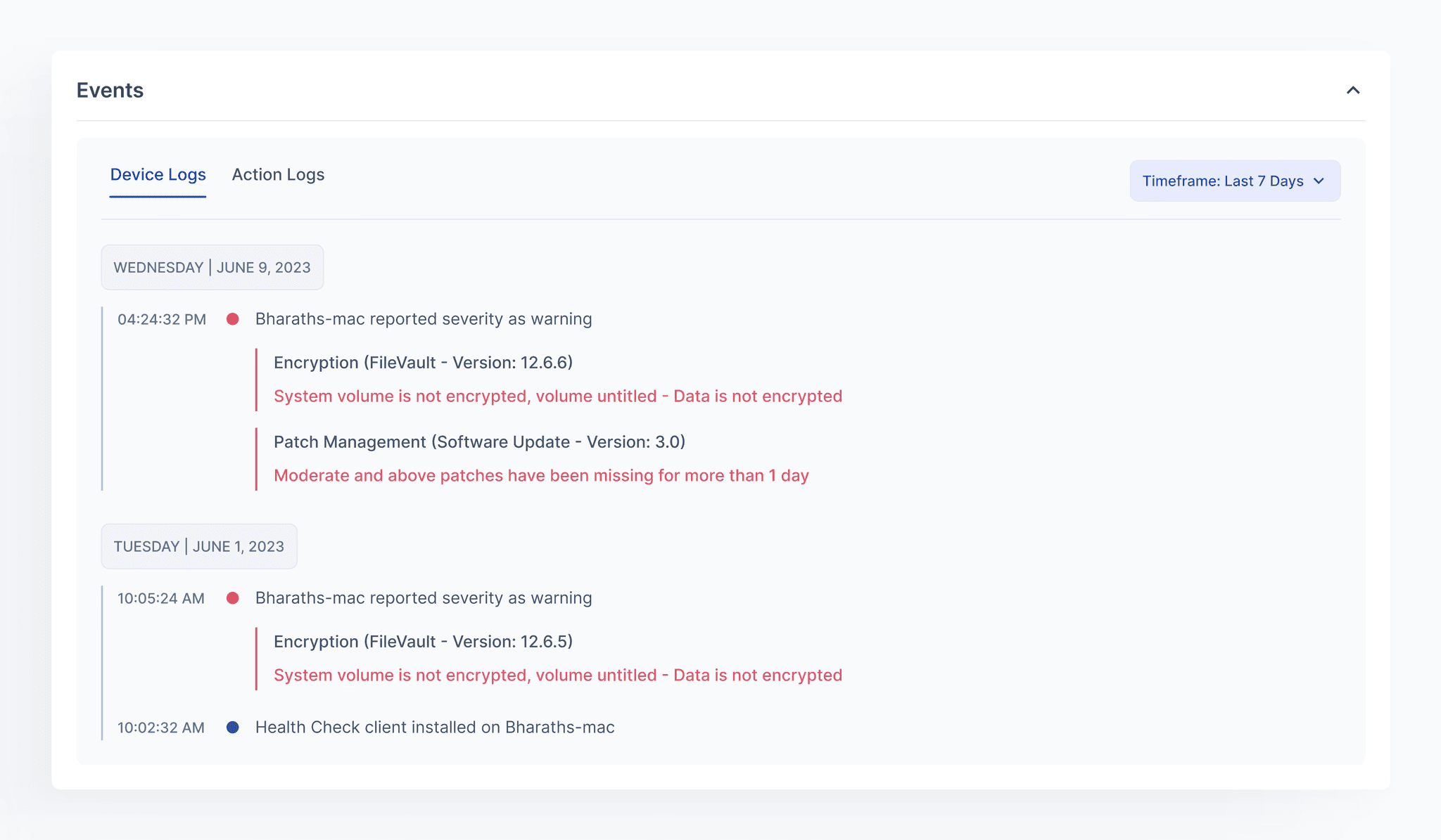
Device Risks - Optimise the layout for easy scannability
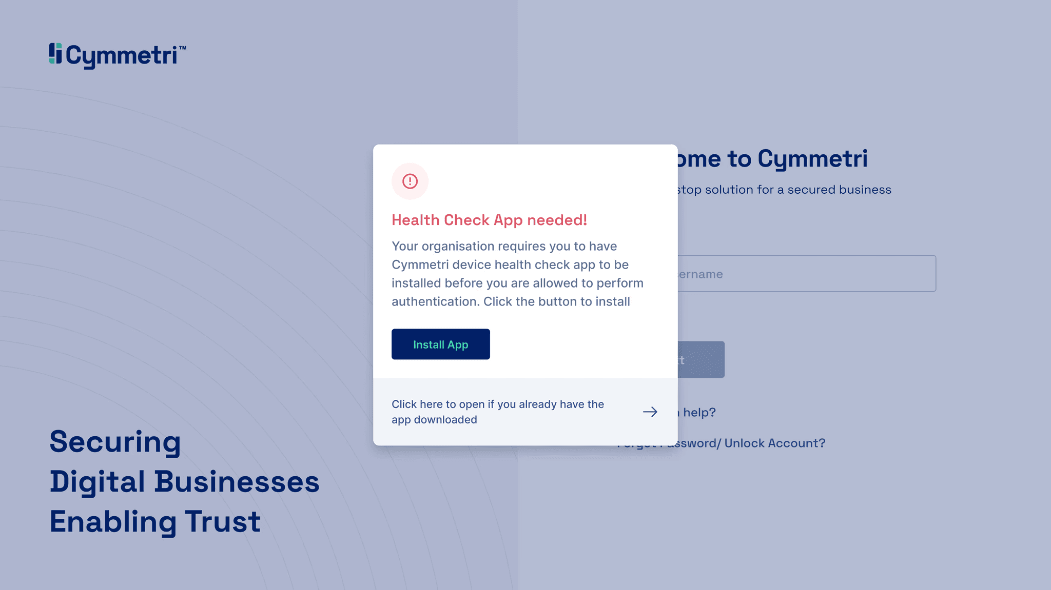
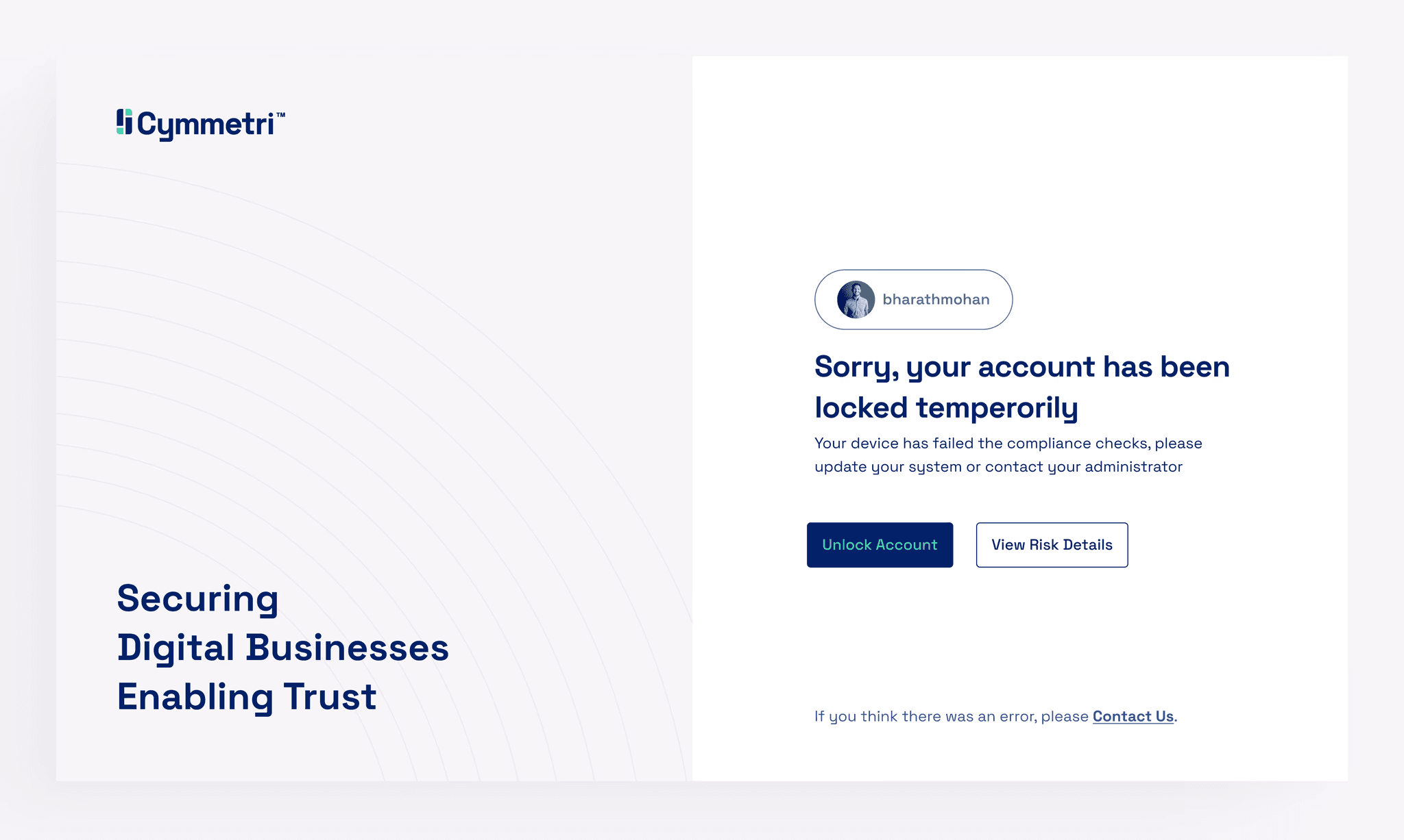
Risk-based authentication uses real-time intelligence to gain a holistic view of the context behind each login for a user. We began by creating a page that offers an overview of the device, the Device Insights page. Identified issues need to be communicated to the user, accompanied by clear and actionable solutions.
We conducted a series of iterative design experiments, evaluating various layouts with focus being, time taken for the user to grasp maximum information.
Risk-based authentication utilizes real-time data to understand the context of user logins. Device Insights is the most important page which provides a clear overview of device details. This page needed to effectively communicate potential risks and offer actionable solutions to users. Some key metrics of the redesigned module;
63% reduction in avg. time spent my employees on the module.
82% increase in the user efficiency for finding exact device problems.
89% reduction in employees contacting managers for solving device issues .

04/ IMPROVEMENT
Our pursuit of user satisfaction led us to seek further improvement. Consequently, we introduced a dedicated page that summarizes and presents all high-priority errors, accompanied by clear instructions on how to address each issue, making the user experience even more seamless.
Conducted extensive research on the problems faced by the employees and dived deep into them to solve it. A few of the solutions in the redesigned module were;
Improved the layout and hierarchy of the presented information.
Introduced a new page where the users can investigate problems and find their solutions.
05/ DILEMMA & SOLUTION
Horizontal Scroll or Dropdown Approach?
Faced with the challenge of information abundance in certain categories, we deliberated between the two options.
Opting for the dropdown approach proved to be our preference. This design choice ensured that users encounter the most crucial details initially, with the option to access additional information selectively. Our decision was validated by user testing, where a majority expressed a preference for the dropdown, affirming its effectiveness over the horizontal scroll.
A major challenge arose from the information overload in certain categories. I had to decide between a dropdown menu or a horizontal layout.
After multiple discussions and user testing, we opted for the dropdown approach. This design prioritizes presenting the most critical information upfront, while allowing users to access additional details as needed.
06
Delivering all the files and the sign off.
With the completion of screen designs, we transitioned to constructing user flows. Every user action was documented, all interactions made and the file was polished and delivered.
Post-handover, the entire team reconvened for a detailed session, carefully going through each element to confirm that nothing had been overlooked during the sprint. This collaborative effort aimed to ensure clarity and alignment among all team members, facilitating a shared understanding of the project.
With the completion of screen designs, I transitioned to constructing user flows. Every user action was documented, all interactions made and the file was polished and delivered.
Post-handover, the entire team reconvened for a detailed session, carefully going through each element to confirm that nothing had been overlooked during the sprint. This collaborative effort aimed to ensure clarity and alignment among all team members, facilitating a shared understanding of the project.


LEARNINGS & RESULTS
Navigating the feedback loop, and articulating the decision-making rationale with two different teams, became an enjoyable albeit initially challenging aspect of the experience.
The final results, earned commendation from both Cymmetri and BSE who perceived it as a significant leap forward in workflow speeds.
Don't hesitate to say hi, let's talk about your design needs

Product
/
Cymmetri
/
2022
A new way to access and manage risks.
Roles & Contributions
Lead Product Designer
Visual Design
Design Team
Pradeep Palaka
Bharath Mohan
Sahil Goyal